Using AI Diagrams and Images to Boost Product Content: A Practical Guide for E-Commerce Blogs

AI Diagrams for E-Commerce Product Content: Practical Use Cases That Help Shoppers
Meta description: Practical ways to use AI diagrams in UK e-commerce content marketing: buying guides, product comparisons, setup instructions, and how-to content.
AI diagrams and images help e-commerce blogs explain complex products faster than text alone. That's not a bold claim, it's a comprehension problem that visuals solve better than paragraphs. The brands seeing the best results from this don't sprinkle generic stock photos into every post. They use visuals strategically in buying guides, product comparisons, and step-by-step how-tos, exactly where shoppers get stuck trying to picture how something works or fits.
I've spent a lot of time looking at why some e-commerce blog posts hold attention while others get skimmed and abandoned. The pattern is fairly consistent: the posts that perform have found a way to show rather than just tell. This isn't really a design trend so much as a content marketing decision, and it's one that UK e-commerce teams competing in crowded categories, including homeware, electronics, beauty, and outdoor gear, can't afford to ignore.
This piece walks through where AI-generated diagrams genuinely earn their place in an e-commerce content marketing strategy, where the evidence for their impact is solid versus where it's more of an educated inference, and how to add them to your existing blog without a full rebuild.
Why product content needs more than text
Shoppers are visual-first by default. Baymard Institute's usability testing on desktop product pages found that the first action most users take is interacting with the image gallery rather than reading the product description (Baymard Institute, product page UX research, baymard.com). That study focuses on product pages specifically, not blog content, but the underlying behaviour, wanting to see before reading, carries across to how people consume buying guides and comparison articles too.
This matters for blog content because readers there are often mid-research rather than ready to buy. They're comparing options, trying to understand a spec sheet, or figuring out whether a product will fit their space or their use case. Dense paragraphs about materials, dimensions, or technical features are exactly the kind of content people skim past, not because they don't care, but because scanning text for one specific answer is hard work.
Visuals reduce that effort. A diagram showing sizing, a chart comparing materials, or an annotated image explaining a technical feature can do in one glance what a paragraph struggles to do in five sentences. Nielsen Norman Group's writing on information design and scanning behaviour (nngroup.com) has long argued that well-designed graphics communicate scale, compatibility, and process more efficiently than prose, particularly for anything with multiple parts or technical specifications. That's a comprehension benefit first and foremost.
It's worth being precise about the SEO angle too, because it's easy to overstate. Google doesn't have a ranking factor that directly rewards diagrams or images. What Google's helpful content guidance does reward is content that answers the searcher's question clearly, keeps people engaged, and demonstrates genuine expertise (Google Search Central, helpful content guidance). A diagram can support that indirectly, by reducing bounce rate, increasing time on page, and making a page more likely to earn links or shares, but the mechanism is comprehension and engagement, not a direct visual-content signal. If your competitor's blog post and yours are both explaining the same water filter using similar phrasing, because product feature lists don't leave much room for originality, the post with a clearer visual explanation is more likely to keep readers engaged. That's a real differentiator, just not a guaranteed ranking boost.
This is also where the phrase e-commerce content marketing is worth pausing on. Visuals aren't a separate tactic bolted onto your content strategy, they're part of how you execute it. Good e-commerce content marketing means matching the format of your explanation to the way people actually process product information, and for a lot of technical or comparative content, that format is visual.
Where AI diagrams beat plain product descriptions
Some types of product information are simply better suited to a diagram than a paragraph. Here's a practical framework for deciding where to invest visual effort first, along with what you need before you commission or generate one.
| Content problem | Recommended visual | Source data needed | Who should validate it | Accessibility requirement |
|---|---|---|---|---|
| Internal mechanism or sequential process (e.g. filtration stages) | Labelled cross-section or flow diagram | Manufacturer spec sheet, engineering drawing | Product or category manager | Descriptive alt text explaining each labelled step |
| Size or fit across a product range | Side-by-side scale diagram | Verified dimensions for every variant | Merchandising team | Alt text with actual measurements, not just "size comparison" |
| Assembly or setup instructions | Numbered diagram with callouts | Existing instruction manual or CAD file | QA or returns team, who see where people get stuck | Text-based step list alongside the diagram |
| Compatibility between products or accessories | Compatibility chart or matrix | Confirmed model numbers and fitment data | Product management, cross-checked against returns data | Table markup with proper headers, not an image-only chart |
| Ingredient or material composition | Icon-based breakdown | Full ingredient or material list from the manufacturer | Compliance or quality team | Full text list included on the page, diagram as a supplement |
A few of these deserve more detail. Assembly instructions are one of the clearest wins for diagrams, because flowing prose is genuinely painful to follow when someone has an Allen key in one hand and a phone in the other. Compatibility charts matter commercially too: getting this wrong is a common driver of the classic "bought the wrong part" support ticket and subsequent negative review, which does more damage to conversion than almost anything else on a product page.
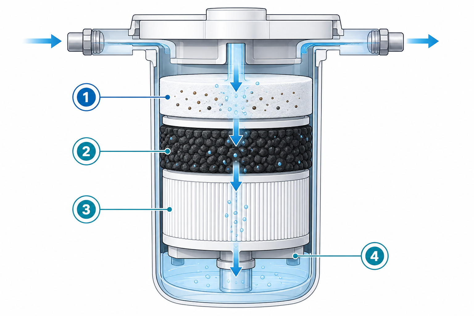
One important caution: AI-generated diagrams are only as good as the accuracy behind them. They should clarify verified product information, not invent features that don't exist. Every AI-generated visual needs sign-off against actual manufacturer specifications, dimensions, and materials before it goes live, ideally by whoever owns that product data internally. The goal is clarity, not creative licence, and a beautiful diagram showing the wrong dimensions is worse than no diagram at all.
When an AI diagram isn't the right call: if the underlying data changes frequently, such as live stock or pricing, a static diagram will go stale fast and a dynamically updated table is safer. And if a product genuinely has one simple feature, forcing a diagram onto it just adds production overhead for no comprehension gain.
How buying guides benefit from visual product comparisons
Buying guides are probably the format that benefits most from visual comparison. Text-based comparisons, the kind where you're reading three paragraphs back to back trying to remember what was said about product one versus product three, ask a lot of a reader's working memory. Side-by-side tables solve this well.
A well-built comparison table lets someone see price, key features, and best-use-case in one view. Salsify's 2022 consumer research (Salsify, "The 2022 Consumer Research Report," salsify.com) found that 87% of UK and US shoppers surveyed said product content was extremely or very important when deciding whether to buy. That's a reasonable proxy for why clarity matters, though it's worth being careful not to claim the same research proves comparison tables specifically reduce returns. That's a plausible inference, not a documented finding from that report.
Here's a simplified example of the kind of table that works far better as accessible HTML than as an image alone:
| Model | Best for | Price (GBP) | Key limitation |
|---|---|---|---|
| Student 13" | Lightweight use, note-taking, browsing | £499 | Limited storage, not suited to heavy editing |
| Everyday 14" | General use, hybrid work | £749 | Mid-range graphics, fine for most tasks |
| Creator 16" | Video editing, design work | £1,299 | Heavier, shorter battery life under load |
Building tables like this as real HTML rather than a graphic matters for two reasons: search engines can read the text content, and screen reader users can navigate it properly. Save the graphic version for visual polish, but always include the equivalent as accessible text.
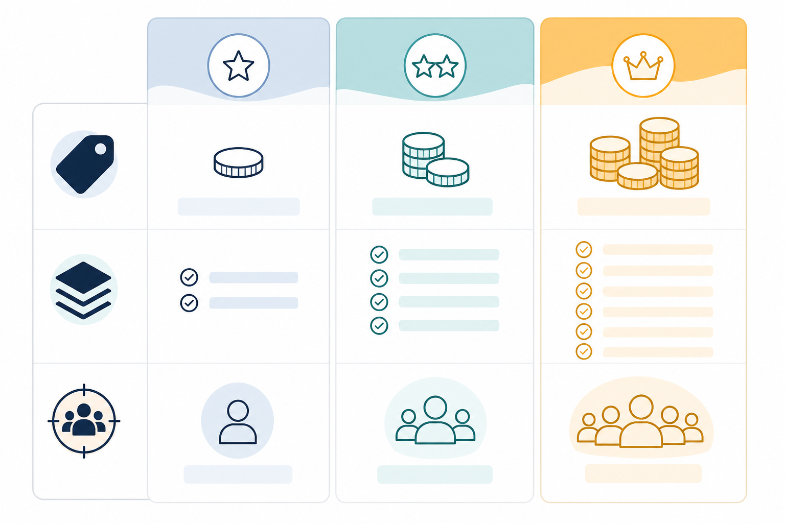
Building these comparison visuals manually for every guide is genuinely tedious, especially if you're publishing regularly and your catalogue changes often. Some AI content tools, including the one I work with at Scribe, can generate comparison visuals from structured product data as part of the content workflow, which removes a chunk of the manual rebuilding work. I'd still recommend treating that as a starting draft rather than a finished asset. Someone on your team needs to check the figures against your live product data before it goes anywhere near a published page, whatever tool produced it.
How to keep AI-generated visuals consistent with your catalogue
Here's where a lot of AI-assisted content falls flat: the images look generic, slightly off-brand, or disconnected from the actual product photography customers see elsewhere on the site. A diagram that looks like it belongs to a different brand undermines trust fast, particularly for UK shoppers who are increasingly wary of anything that feels like an AI-generated afterthought rather than genuine product information.
A visual style guide solves most of this before it becomes a problem. It doesn't need to be an elaborate brand book. A simple one-page reference covering the following is usually enough:
- Colour palette and contrast ratios checked against WCAG AA guidelines, so diagrams stay legible for users with low vision
- Typography that matches your existing site fonts rather than whatever a generator defaults to
- Icon style and meaning, so the same icon always represents the same thing across posts
- Product photo treatment, so diagrams sit visually alongside real product shots without looking mismatched
- File format and compression: SVG for line diagrams where possible for crisp scaling, compressed WebP or JPEG for photographic elements, to avoid slowing page load
A few practical guardrails worth setting alongside that:
- Write descriptive alt text for every diagram. Not just "product diagram," but something like "Cross-section of three-stage water filter showing carbon, sediment, and membrane layers." This helps accessibility and gives search engines useful context.
- Avoid generic AI imagery that looks disconnected from your actual product photography. If your product photos are clean and minimal, your diagrams shouldn't suddenly look like a different aesthetic entirely.
- Standardise diagram formatting across a blog series so consistent fonts, icons, and layout build recognition even when readers are scanning quickly.
- Review performance periodically rather than assuming automation gets it right the first time. Some platforms, including Scribe, track engagement metrics across published posts and can surface which visual styles perform better over time. Treat that as a helpful data point to review manually every few months, not a set-and-forget system.

Quick wins for adding AI diagrams to existing blog posts
You don't need to rebuild your entire blog to benefit from this. Most e-commerce teams have a backlog of existing posts already ranking reasonably well but underperforming on engagement. Adding visuals to that backlog is often faster, and more measurable, than writing new content from scratch.
Here's a practical sequence to work through:
- Audit your top-performing posts first. Don't rely on bounce rate alone. Look at scroll depth, on-page search terms if you have them, exit rate by section where your analytics allow it, and support tickets that reference confusion about sizing, compatibility, or setup. These signals point more precisely to where people are struggling.
- Add one diagram to the weakest section. Don't overhaul the whole post. Identify the single section causing the most drop-off, using the signals above, and add a targeted visual there. Record a baseline for that section's engagement metrics before you publish the change.
- Refresh outdated comparison tables. If your buying guides reference older product versions or pricing, update the data and rebuild the table as accessible HTML with a supporting visual, rather than a plain text list.
- Use AI image generation for header images sparingly. A stale header image can make solid content feel dated, but prioritise explanatory visuals inside the body copy over decorative header refreshes. The header is a nice-to-have; the mid-article diagram is doing the actual comprehension work.
- Re-publish and monitor properly. Push the update live through your CMS, whether that's Shopify, WordPress, Wix, or Webflow, and track engagement changes over four to six weeks rather than a few days, to avoid mistaking normal traffic fluctuation or seasonality for the effect of your change. Compare the updated page against a similar post you haven't touched, as a rough control.
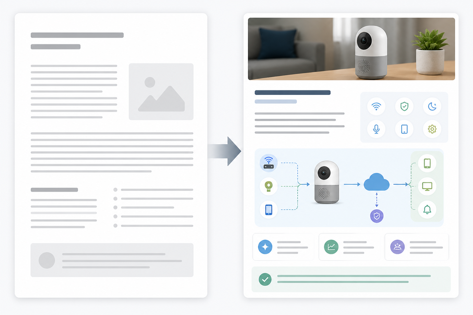
When you're doing this across dozens or hundreds of product-related posts, which is realistic for most established e-commerce catalogues, manual, post-by-post updates get tedious fast. This is the kind of repetitive, high-value work that AI-assisted publishing tools are built to speed up. Scribe, for example, can generate a full blog post including diagrams in a few minutes rather than a few hours, which makes working through a large backlog realistic. That said, the time saving is in first-draft production, not in the review step. Someone still needs to check facts, figures, and brand fit before anything goes live, regardless of which tool created the draft.
Frequently asked questions about AI diagrams in e-commerce
Can AI diagrams help explain complex products?
Yes, particularly for products with multiple components, technical specifications, or step-by-step usage instructions. A well-placed diagram can replace several paragraphs of dense explanation. The caveat is accuracy: every AI-generated diagram needs checking against verified manufacturer data before publishing, since a visually convincing but factually wrong diagram can do more damage than plain text ever would.
What kind of e-commerce blog content benefits most from visuals?
Buying guides, product comparisons, and how-to or setup content see the biggest lift, because these formats naturally involve decision-making or process explanation. The exception is very simple products with a single obvious feature, where a diagram adds production time without adding much comprehension value.
How do I add visuals to older blog posts without a redesign?
Start by identifying posts with good traffic but weak engagement using scroll depth and exit-rate data rather than bounce rate alone, then add a single relevant diagram or updated table to the weakest section. Keep an accessible text version of any table or chart alongside the visual, and monitor results over several weeks before rolling the same change out further.
The bottom line: using AI diagrams strategically
This isn't about making your blog look prettier for its own sake. It's about matching how people actually process product information: quickly, visually, and with a strong preference for clarity over comprehensiveness. Get that right in even a handful of key posts, track scroll depth, time on page, and assisted conversions properly, and you'll have real evidence of what's working rather than a hopeful assumption. Whether that engagement improvement eventually shows up in organic traffic is worth measuring separately. It's a plausible outcome, not a guaranteed one, and treating it as guaranteed is exactly the kind of overclaim this whole approach is meant to avoid.
Create content like this automatically
Scribe uses AI to generate high-quality blog posts that engage your audience and drive traffic.