Loading...
If you want a starting benchmark for DTC ad creative, look at longevity. An ad a competitor keeps running for weeks may be doing something right, so it's a sensible place to look for ideas. But it's a clue, not proof. Public ad libraries don't show spend, conversions or return on ad spend, so you can't know an ad is profitable just because it's still live.
The method is simple. Find long-running ads and run a creative teardown on each one, looking at hook, offer, proof and format. Then look for patterns that repeat across several brands, and turn those patterns into a checklist of hypotheses to test in your own ads. Test, don't copy.
Below I'll walk through how to do that properly, caveats included.
Most swipe-file inspiration comes from award shortlists, viral clips and 'best ads of the year' roundups. They're fun to look at, but they tell you very little about profitability. A video can get millions of views and still lose money. An award can go to a brilliant idea that never sold a single unit.
Long-running ads aren't a perfect fix, but they're a better filter. If an ad has stayed live for a while, someone at that brand has at least chosen not to switch it off. That's a weak but useful signal, and it's closer to what you care about than applause is.
As for how long 'a while' is, I use about four weeks as a rough screening rule. It isn't a validated threshold. Adjust it for your category, since a fast-moving fashion brand and a considered-purchase mattress brand run on very different rhythms.
I want to be straight with you here. Public ad libraries, such as the Meta Ad Library and Google's Ads Transparency Center, show what's running. They don't show spend, audience, conversions or why an ad is still live. An ad might be running because:
So always check at the individual-ad level, and record the market and the date you looked, because ad status changes.
The most interesting candidates combine longevity with other cues. Treat each one as a clue, not a confirmation:
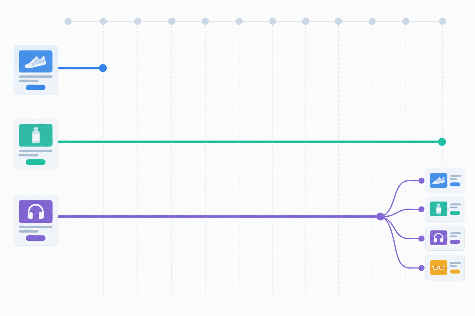
The Meta Ad Library is a great free starting point, but it's manual, it doesn't keep a history of what changed, and it won't give you a cross-platform view. You end up with screenshots and a vague memory of what was there last month.
What helps is a weekly comparison: a simple 'what's new, what's stopped, what's still running' check. You can do it in a spreadsheet with dated screenshots, or with a monitoring tool. Either way, remember you're inferring from what's visible. You're not seeing performance. I'll say more about tools in the swipe-file section below.
A creative teardown is a structured way of asking 'what is this ad actually doing?' rather than 'does it look nice?'. Here's the six-step version I'd use.
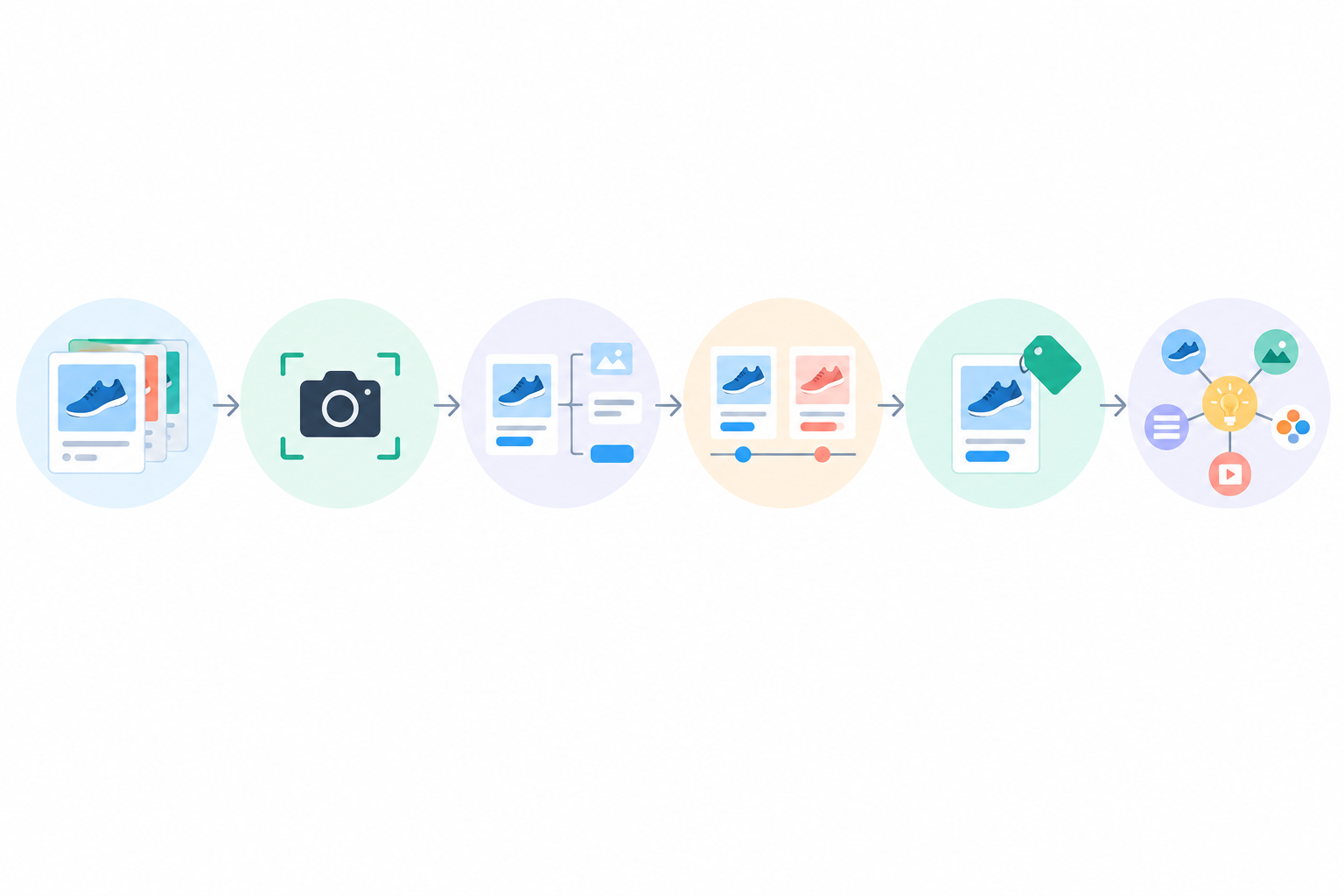
Say you're tearing down five haircare brands. Here's what one row of your notes might look like, and how it becomes a test.
| Field | Example entry |
|---|---|
| Observation | Four of the five longest-running ads open with a close-up of a customer's before state and a one-line complaint, with no brand name for the first two seconds |
| Format | UGC-style talking head, vertical video |
| Offer | Bundle, free delivery over a threshold |
| Proof | Star rating and a customer quote overlay at around the halfway point |
| What we don't know | Spend, audience, whether the ads actually convert, or why they're still live |
| Our hypothesis | An opener built around our own customers' most-repeated complaint will earn more attention than our current brand-first opener |
| Test | Same offer, same audience, same length. Only the first three seconds change |
| Metrics | Three-second view rate (or your platform's equivalent), click-through rate, cost per purchase |
Notice what happened there. The pattern suggested an idea. It didn't prove anything. The test is what tells you whether it works for your product and price point.
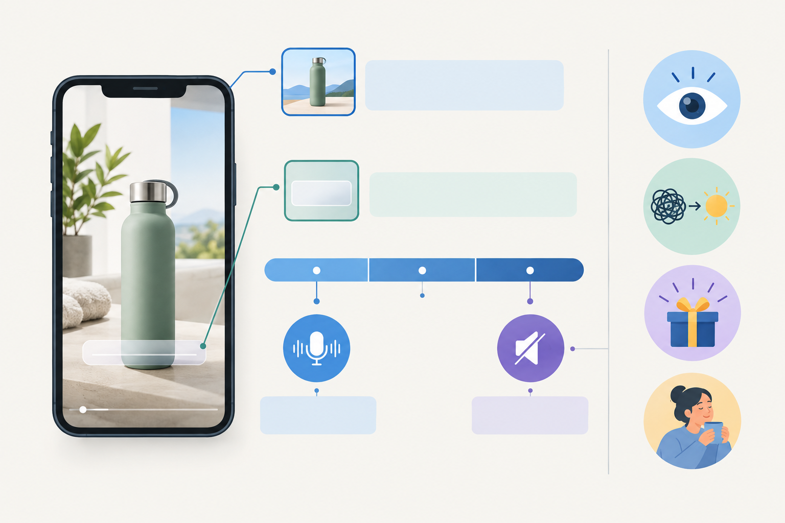
On Meta and TikTok, the opening seconds do a lot of the work. People scroll fast, and video often autoplays silently. Both platforms' creative guidance generally advises getting to the main point early (see TikTok for Business and Meta's creative guidance for current recommendations). I treat 'three seconds' as a handy review test, not a fixed law. How much the hook matters still depends on placement, audience, product and whether the rest of the ad pays it off.
Treat the opening as its own creative unit and note four things: the first spoken line, the on-screen text, the opening frame, and who or what is on screen. Then check that the rest of the ad pays off the hook. An attention-grabber that doesn't connect to the offer is just noise.
If you're selling in the UK, check the practical details against your own UK customer research: British spelling, prices in £, delivery terms (is free next-day delivery a real selling point for your customers?) and tone. Some brands find a drier, more understated style lands better. Others find it makes no difference. Treat it as something to test, not a rule.
Could someone understand the product and the promise with the sound off, within a few seconds? If not, the hook may be doing too little.
One honest limit: you can't see a competitor's hook rate (the share of viewers who keep watching past the opening) or their click-through numbers. You can only infer from longevity and variations, so treat your conclusions as hypotheses.
A good hook earns attention. The offer and the proof help turn that attention into a sale.
Clarity matters as much as generosity. In Baymard Institute's checkout research, 48% of surveyed US online shoppers who had abandoned an order cited extra costs such as shipping, taxes or fees. It's a US survey and it's about checkout, not ads, so it won't predict your results. Still, it's a good reason to note whether a competitor's ad makes the full deal obvious (price, delivery, any subscription terms) or saves it for checkout.
Look for the same creative running with different offer overlays or landing pages across weeks. That suggests a brand may be testing the deal while holding the creative constant, which is handy for your swipe file. It also pays to watch competitor promotions around UK moments like Black Friday, Boxing Day sales, Mother's Day and back-to-school. Seeing how rivals build up to those weeks (and when they stop) gives you a rough view of their promotional calendar.
There's good evidence that reviews matter. Northwestern's Spiegel Research Center analysed purchase behaviour on a retail site and reported that displaying reviews was associated with a 270% higher purchase likelihood, and 380% for higher-priced products. That's an association from one specific study, not a promised lift for your ad. In a teardown, the more useful question is whether the proof is specific, believable and relevant to the claim, not just whether a star rating exists.
Note how competitors phrase returns windows and money-back guarantees. In the UK, consumers generally have a 14-day cancellation right for distance sales, so a '30-day returns' line is often adding to a legal baseline rather than inventing one. Exceptions and conditions apply (for some personalised or perishable goods, for example), so check the current GOV.UK guidance on online and distance selling before you write your own terms.
On advertising rules, the ASA and the CAP Code expect claims, testimonials and 'was/now' pricing to be substantiated and not misleading. A competitor's copy might not meet that bar, so adapt the pattern and never lift the wording.
Once you've catalogued enough ads, the copy starts to rhyme.
For primary text, you'll mostly see four structures: problem, agitate, solution; a short, punchy benefit stack; story-led long copy; and review-led copy that opens with a customer quote.
Headlines tend to follow a few patterns too:
CTAs should match the offer. 'Get 20% Off' belongs with a discount, 'Shop Now' with a straightforward product push, and 'Learn More' with something that needs explaining.
Then there's language mirroring. Good copy often reuses phrases customers wrote in their own reviews. If three competitors' ads all say 'no more sticky residue', that's a phrase worth checking against your own reviews.
Here's a time-saver I like. Rather than storing whole ads, add a 'copy pattern' column to your teardown sheet and write the structure in a few words, such as 'quote opener, three benefits, delivery line, CTA'. Repeated structures become much easier to spot.
Here's something reassuring: many long-running ads are surprisingly simple. In my experience, clarity matters more than polish, though that's a pattern to test, not a guarantee.
| Format | Best for | Typical hook style | Production effort | Where you'll see it |
|---|---|---|---|---|
| UGC-style talking head | Trust, problem-solution | Direct problem call-out | Low | TikTok, Meta |
| Product demo | Making a claim tangible | Show the result first | Low to medium | Meta, TikTok, Google |
| Static with review overlay | Proof-led, quick tests | Star rating plus quote | Very low | Meta, Google |
| Carousel | Ranges, bundles, benefits | Benefit or offer on card one | Low | Meta, LinkedIn |
| Split-screen comparison | Differentiation, before/after | Contrast in the first frame | Medium | Meta, TikTok |
| Founder video | Story, premium or high-ticket | Direct address | Low to medium | Meta, LinkedIn |
| Motion-graphic explainer | Complex or novel products | Bold claim with animation | Medium to high | Meta, LinkedIn, YouTube |
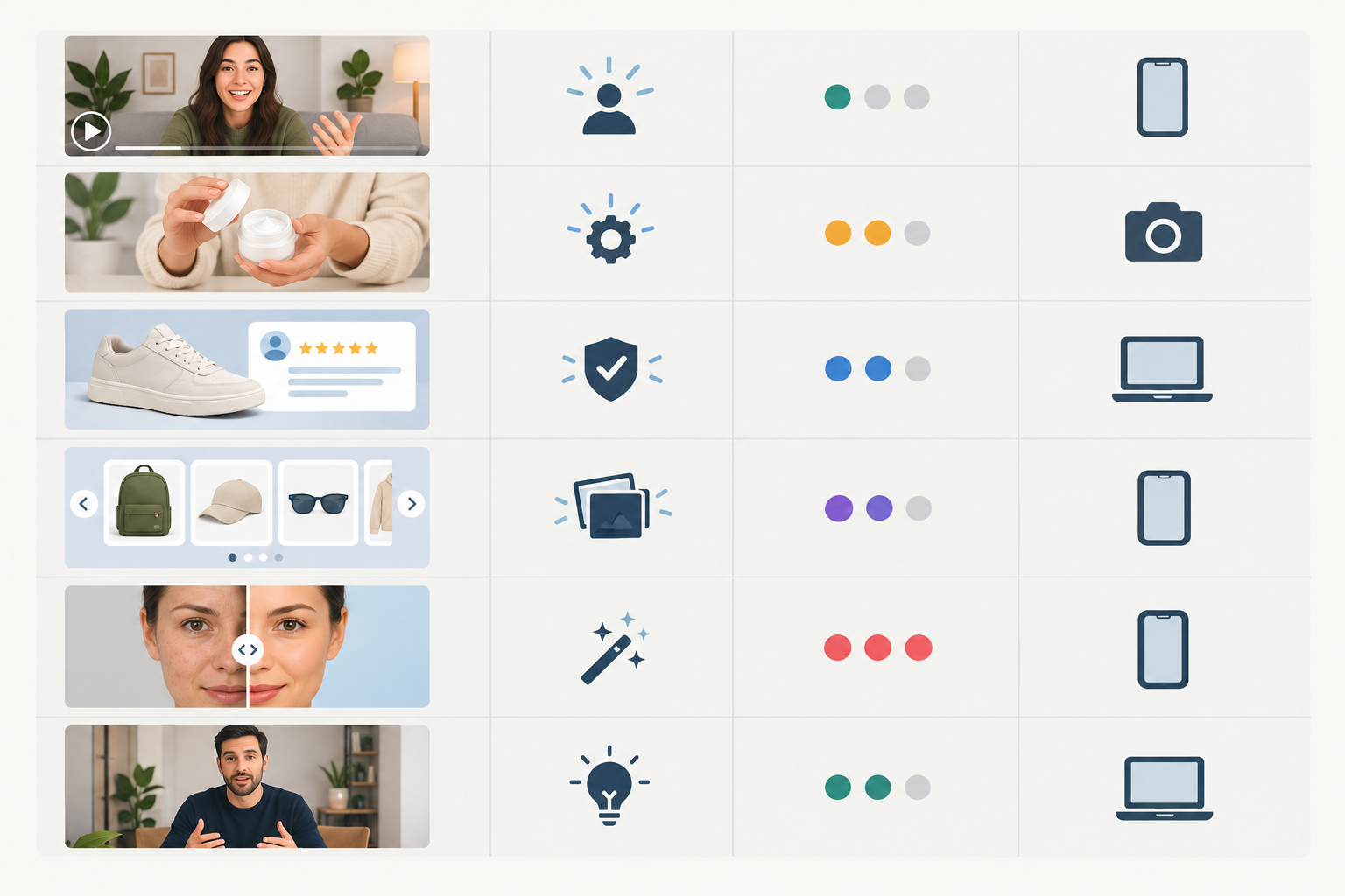
These are common guidance points, not universal performance rules. Test each on your own account.
If your production budget is tight, work up the effort ladder. Start with a static with a review overlay, then try a UGC-style talking head, then a product demo, and only after that invest in founder video or motion graphics. Hold the offer and audience constant so you learn what the format changed. Purple's 'Raw Egg Test' is a good reminder that a simple, legible demonstration can carry a claim, as long as you can substantiate it.
Borrowing a structure is smart. Copying creative, copy or brand assets is ineffective (your customers know your brand, not theirs) and a genuine legal and reputational risk.
Think of every competitor angle as a hypothesis to test against your own product, audience and price point. Then look for gaps:
Here's how that plays out in practice. Say rivals' long-running ads all open with a problem call-out. Keep that structure, but build yours from your own customer reviews. If your reviewers keep saying 'finally, a moisturiser that doesn't sting', that's your opening line. Same skeleton, entirely your own substance.
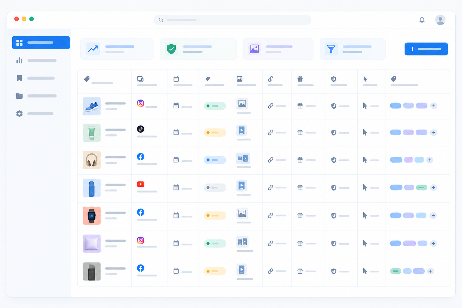
A swipe file (a saved collection of ads and notes you can search when a brief lands) is only useful if you can filter it quickly. Here's a simple way to build one.
If you work in a team or agency, make sure the insights actually reach the brief. Shared folders, a named owner for each competitor and a regular slot to review findings help a lot.
Manual tracking works, but it gets tedious once you're past a handful of competitors. If you'd rather automate it, look for a tool that archives creative and copy, shows weekly changes, and covers the platforms you advertise on. Check what it genuinely observes and what it only infers, since public data varies by platform and no tool can show a rival's spend or results.
Full disclosure: we make one such tool, Rival Ads. It tracks competitor ads across Meta, Google, TikTok and LinkedIn without needing access to your ad accounts, and it produces a weekly summary of new and stopped ads plus AI-generated analysis of the changes. Plans started from $29/month at the time of writing, so check the site for current details. It's one option among several, and the method in this guide works fine with a spreadsheet too. 🙂
Here's the one-pager distilled from everything above. Run each new concept through it before it goes to production.
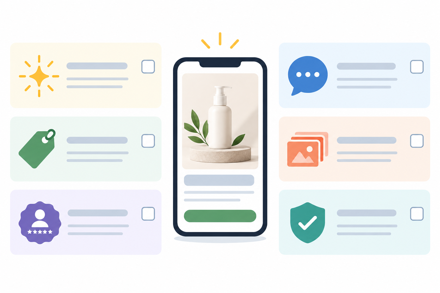
Don't treat the checklist as finished. Keep watching 5-10 competitors, update it as angles rise and fall, and let your own test results overrule anything you've borrowed from them.
There's no single formula, but converting ads commonly combine a clear early hook, a specific offer, believable proof and one next step. Format and polish often matter less than how quickly the viewer understands what the product does for them. Your own testing is the only way to know what works for your audience.
Start with the competitors your customers already compare you with, then look at which of their ads have run the longest or have multiple variations. The Meta Ad Library and Google's Ads Transparency Center are free starting points. A monitoring tool can save time by tracking changes weekly across platforms.
Treat them as hypotheses, not templates. Borrow the underlying structure, such as a problem call-out or a review-led opener, then rebuild it with your own product truths and customer language. Never lift copy or assets directly.
Use consistent fields such as brand, platform, start date, status, format, hook type, offer, proof and CTA, and tag each ad by angle. Archive the actual creative and copy, review weekly, and boil what you learn down to a one-page checklist.
No. Some ads run for brand awareness or simply haven't been switched off, and public libraries don't show spend or results. Longevity is most useful as a screening clue, especially when you also see consistent landing pages and similar patterns across several competitors. Then test the idea yourself.