5 Signs a Competitor's Ad Campaign Is About to Get Killed (Before They Pull It)

5 Signs a Competitor's Ad Campaign Is Failing (And What Ad Intelligence Can Tell You)
A practical guide to reading competitor ad behaviour without overclaiming what the data actually shows.
A dying ad campaign rarely disappears without warning. It usually leaves a trail behind it: shrinking ad sets, frantic creative rotation, copy-only tweaks, shortened run times, sudden platform exits. None of these on its own proves anything. But when you see a few of them stacking up together, you've got a genuinely useful early warning system - one that stops you chasing angles that are already dying and helps you back the ones with real staying power.
I've spent a fair chunk of time watching competitor ad accounts in the UK and beyond rise and fall, and the pattern holds up more often than not. Nobody announces a failing campaign. There's no press release, no LinkedIn post saying "well, that one flopped." The ad just quietly gets weaker week by week until one day it's gone. If you know what to look for, you can often see it coming - though I'll say this upfront: what you're spotting is a pattern of behaviour, not a diagnosis you can bank on.
What ad intelligence can and can't tell you
Before getting into the five signs, it's worth being honest about the limits here. Public ad libraries and ad intelligence tools show you what's visible: which ads are live, how many creative variations exist, how long an ad has run, where it's showing up. They don't show you spend, conversion rates, audience targeting, or the actual reason a campaign got paused.
That matters because a shrinking ad set could mean a dying campaign, or it could mean a deliberate consolidation around a winner, a restructured account, a paused product line, or just a quieter production month. The signals in this post are worth investigating, not proof of failure. Your confidence in any single signal should go up a lot when you see two or three of them together, over more than one observation period. Think of this as a filtering tool, not a verdict machine.
One terminology note, because it trips people up: an ad is a single creative execution, an ad set is a group of ads typically sharing a budget and audience, and a campaign is the structure sitting above both. Platform presence - whether a competitor is active on Meta, Google Ads, TikTok, or LinkedIn - is a separate layer again. Mixing these up is one of the easiest ways to misread what you're seeing, so I'll try to be specific about which layer each sign applies to.
Why "what's working?" is the wrong question
Most competitive research starts and ends with one question: what's working for them? Fair enough, it's the obvious starting point. But it's only half the picture, and honestly, the easier half.
Here's the problem. If you only look at what appears to be a winning ad, you're going off a single snapshot in time. An ad that looks great this week might already be on its way out. Copy it, and you risk inheriting someone else's failing experiment - except now it's your budget and your creative hours on the line, not theirs.
Flip the question. Ask what's failing instead. That reframe changes how you use competitor research. Instead of chasing shiny objects, you start filtering out likely dead ends before you sink money into them. This is where ongoing ad intelligence across Meta, Google Ads, TikTok, and LinkedIn stops being a curiosity exercise and turns into something genuinely useful - you're not just collecting ads, you're reading the behaviour underneath them, with a healthy amount of caution about what that behaviour actually proves.
With that caveat out of the way, here are the five signs I look for - and, just as importantly, the other explanations worth ruling out before you draw any conclusions.
Sign 1: Shrinking ad set size
This is usually the first tell, and easy to miss if you're not tracking things consistently. When a competitor launches a new campaign, they'll typically test a wide spread of creative within an ad set - different hooks, formats, angles. That's normal and healthy. What's worth noting is when that number quietly shrinks week after week with nothing new coming in to replace what got cut.
An ad set that launched with 15 to 20 creative variations and is now down to two or three might just be consolidating rather than scaling. Teams rarely kill a whole campaign in one dramatic move. They trim it, let the apparent survivors run for a bit, then let those fade too. Rapid consolidation within two or three weeks of launch is worth a closer look.
Other explanations to rule out first: the brand may have deliberately put spend behind an early winner (smart strategy, not failure), restructured the account, hit a seasonal lull, or simply paused production while a new batch gets made. A shrinking ad set on its own tells you "something changed." It doesn't tell you "this failed."
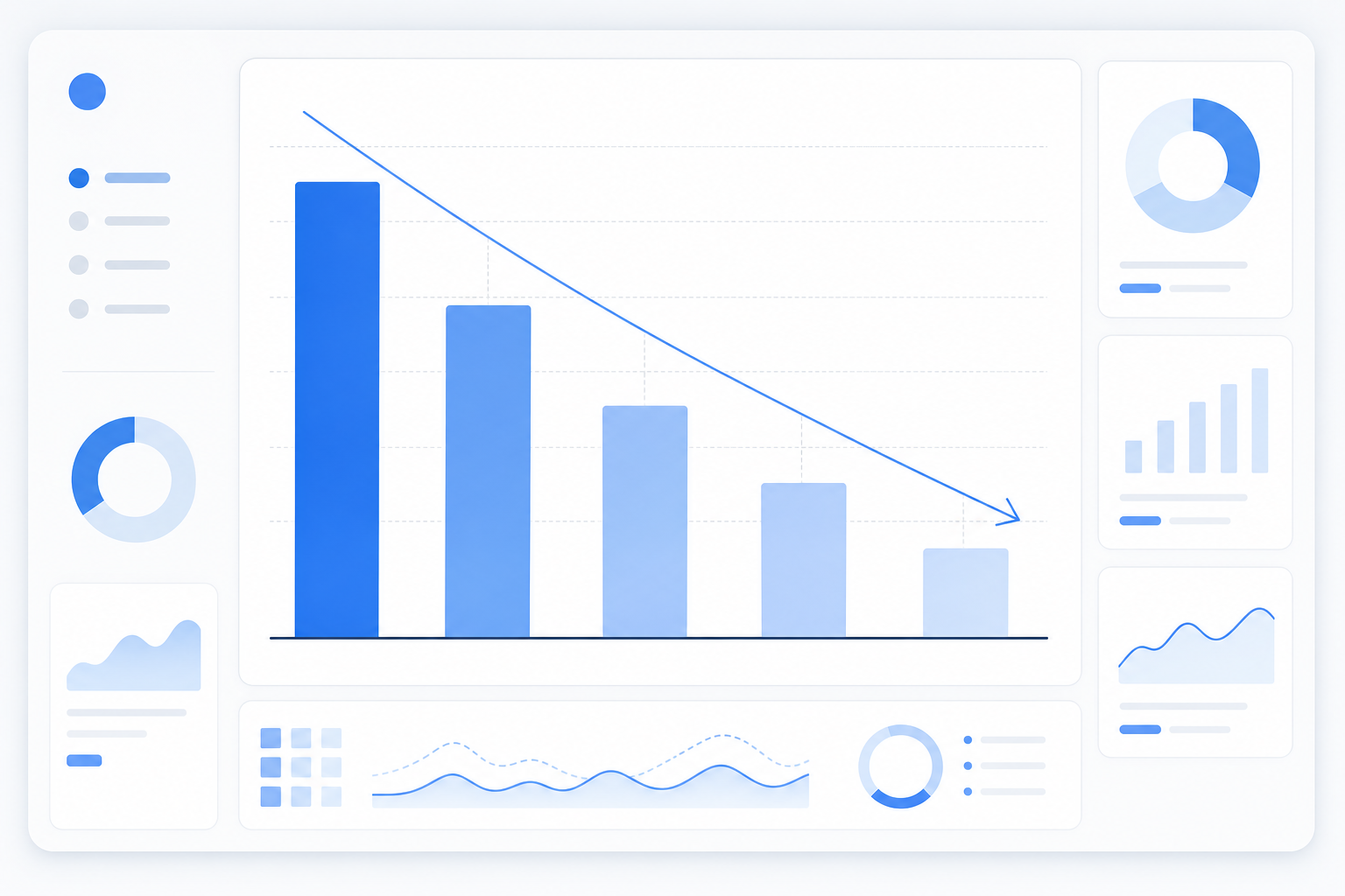
This kind of pattern is genuinely hard to spot from memory - you'd need to recall exactly how many ads a competitor was running four weeks back. That's why week-over-week creative counts, tracked automatically, matter. They make the trend visible instead of leaving you to piece it together from a vague recollection.
Sign 2: Rapid creative rotation
Here's a question I get a lot: what does rapid creative rotation usually mean? Often, though not always, it means a team is still hunting for a working angle rather than running a deliberate testing rhythm.
Healthy creative testing tends to have a traceable logic to it. A team launches a batch, lets it run long enough to gather real data, reviews the results, then iterates - headline A didn't land, so they try a benefit-led headline B, and so on. You can usually follow the thread.
What's worth flagging is rotation with no obvious thread, relative to that competitor's own historical cadence. New creative every few days, jumping from UGC-style testimonials to a motion graphic to some unrelated offer angle, with no winner settling in over multiple cycles - that's a reasonable sign the team hasn't found traction yet.
Other explanations to rule out first: some brands run sophisticated, high-frequency multivariate testing as standard practice - rapid rotation is just how they operate, win or lose. Platform algorithm changes, planned seasonal refreshes, or a genuinely large production pipeline can also produce fast turnover without anything being "in trouble." The tell isn't speed by itself, it's speed combined with no consistent winner ever emerging.
Sign 3: Copy changes without new creative
This one's subtler, but once you start noticing it, you'll see it fairly often. The visual or video stays exactly the same while the headline, primary text, or call-to-action keeps shifting week after week.
A plausible reason: the creative asset was expensive or time-consuming to make - a polished video shoot, a custom animation - and the team doesn't want to scrap it. So instead, they test new copy angles on the same visual, hoping wording alone can save it.
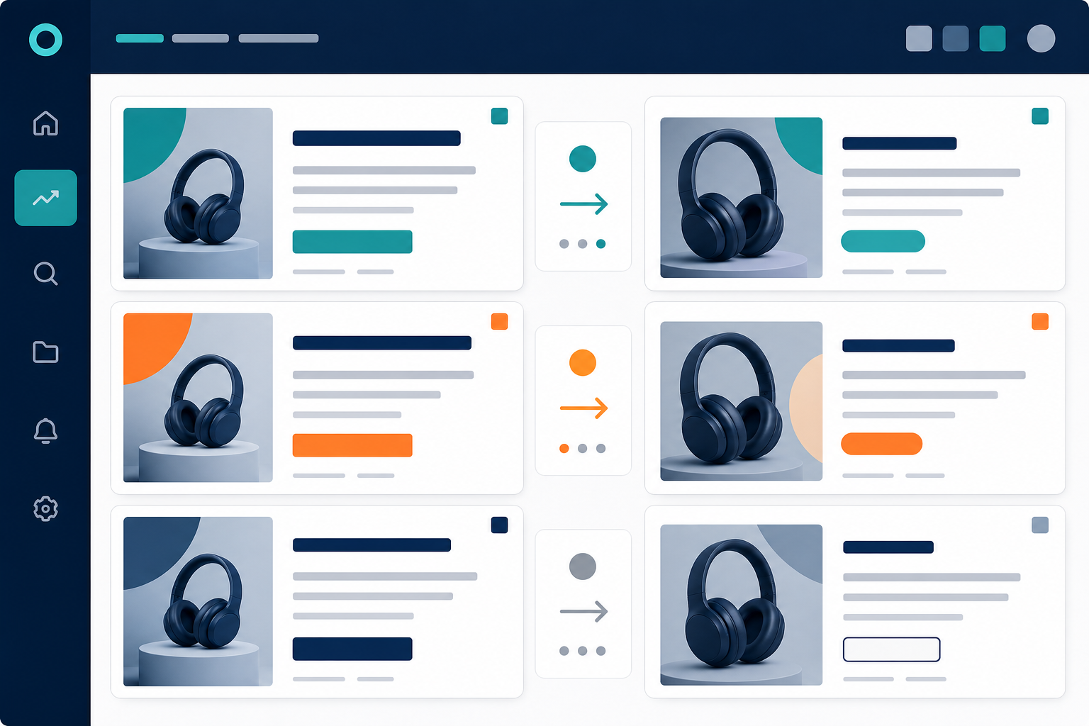
Other explanations to rule out first: this can also be a completely normal multivariate copy test with stable delivery and a healthy budget behind it, especially if it's paired with new audience segments rather than desperation. Before you conclude the creative "isn't landing," check whether the ad has kept running consistently (suggesting it's fine and just being refined) or whether run time is also shortening alongside the copy churn (suggesting the opposite). This pattern only becomes useful if you're tracking the exact copy over time, which is exactly why a diff view matters.
Sign 4: Shortened run time
Run time is one of the most useful signals in competitor ad tracking, and it answers a question I hear constantly: how long do losing ads typically run before getting pulled?
There's no universal industry number here, and I'd treat any specific figure - including ones I've seen personally across tracked accounts - as illustrative rather than a hard rule. What matters far more is a competitor's own historical pattern. If their track record shows winners usually running six to eight weeks with only minor refreshes, but the current batch is getting pulled after 10 to 14 days, that gap is worth investigating.
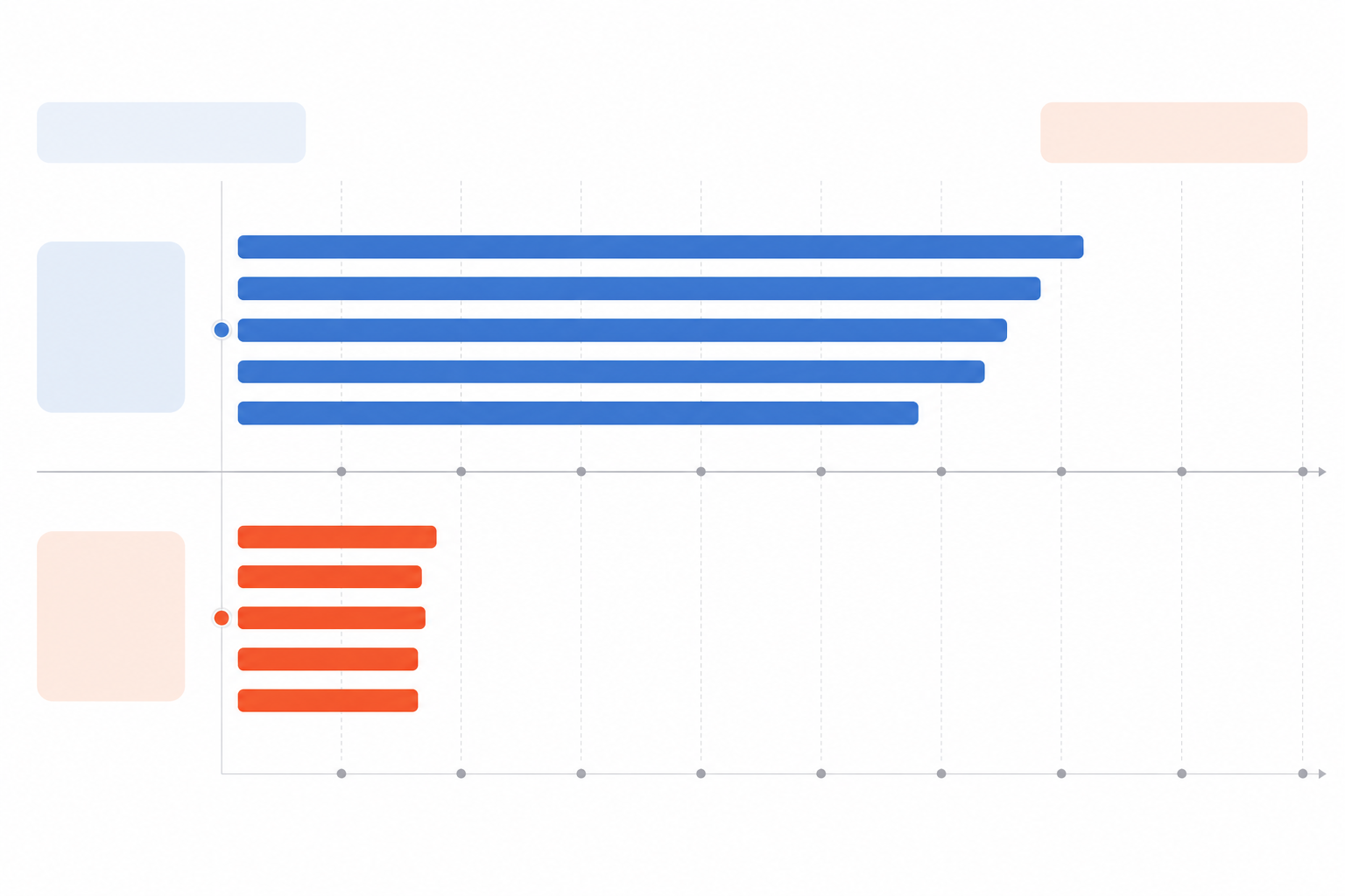
Other explanations to rule out first: seasonal campaigns are often intentionally short. Product launches, limited-time offers, and compliance-driven pulls (a claim getting flagged, say) can all shorten run time without any performance issue at all. The signal only means something when you compare it against that specific competitor's own baseline, built from consistent tracking rather than a one-off glance.
Sign 5: Sudden platform-specific drop-off
The last sign is about where a competitor is, or isn't, showing up rather than what they're running. If a competitor was active on Meta and then goes quiet there while staying active elsewhere, that's worth a look. But I want to be careful with this one - it's the least specific of the five and the easiest to over-read.
There's an important distinction between two patterns:
- Total disappearance across all platforms at once often points to something bigger than creative performance - a product issue, an inventory problem, a seasonal shift, a company-wide budget freeze. It's rarely about the ad itself.
- Partial withdrawal from a single platform - say, pulling ads from TikTok while staying fully active on Google Ads - usually reflects a channel or format decision, not proof the offer failed. It might just mean the platform-specific creative wasn't resonating there, even though the same offer is doing fine elsewhere.

Other explanations to rule out first: budget reallocation between channels, a deliberate seasonal channel strategy, or a platform-specific policy issue can all produce this pattern without any underlying campaign failure. On its own, platform withdrawal tells you about a channel decision, not whether the creative or offer actually worked.
How confident should you be? A simple framework
Given that none of these signals is conclusive by itself, it helps to have a rough rule of thumb for how much weight to give what you're seeing:
- One signal, spotted once: a watch item. Note it and check again next week.
- Two signals together, sustained across two or more weeks: a working hypothesis. Worth digging into before you make any decisions based on it.
- Three or more signals, especially paired with a run time well below that competitor's own baseline: reasonable grounds to hold off copying that angle until you've validated it yourself.
This isn't a scientific formula - it's a sense-check to stop you overreacting to a single week's snapshot, which is the most common mistake I see people make with this kind of research.
How to track these signals weekly
Knowing what to look for is one thing. Catching it in time to actually act on it is another. Here's a practical process:
- Set up ongoing monitoring instead of relying on manual spot-checks. A single visit to a competitor's ad library tells you almost nothing on its own - you need a running record to spot shrinking ad sets, rotation patterns, and run-time trends against that competitor's own baseline.
- Log the specifics, not just impressions. A simple weekly record works: observation date, platform, creative ID or description, first-seen date, last-seen date, number of copy variations, and a note on any alternative explanation you've considered. This is what turns "I think their ads changed" into something you can actually compare week to week.
- Review week-over-week differences for new, stopped, and scaling ads. This is the core data that makes all five signs visible. Without it, you're relying on memory and guesswork, and that rarely holds up over multiple weeks.
- If your monitoring tool offers AI-generated summaries, treat them as a starting point, not a final answer. Automated flags for rapid rotation or shrinking ad sets can save you time scanning dozens of accounts, but check them against the underlying ads and dates before acting - pattern-matching software produces false positives more often than you'd like.
- Use ad intelligence as a filter, not a verdict. If a competitor's angle shows multiple failure signals, treat that as a reason to pause and dig deeper before copying it, not as proof the whole category is dead. Sometimes a good idea just had weak execution behind it. The goal is learning from the pattern, not writing off the entire approach.
Teams that track this consistently, across every platform a competitor touches, tend to build a sharper feel for what's genuinely working in their market versus what just looked promising for a week or two before quietly disappearing.
Frequently asked questions about competitor ad intelligence
How can I tell if a competitor's ad is failing?
Look for a combination of signals rather than leaning on any one - shrinking ad sets, rapid rotation with no settled winner, copy-only edits on a static visual, a shorter-than-usual run time, and platform-specific withdrawal. One signal alone could easily have an innocent explanation, like seasonality or a production gap. Two or three together, sustained over a couple of weeks, gives you a much more reliable read.
What does rapid creative rotation usually mean?
Often it means the team hasn't found a winning angle and is testing quickly to limit wasted spend - but not always. Some brands run high-frequency testing as standard practice regardless of performance. The more telling detail isn't rotation speed on its own; it's rotation with no clear winner ever settling in over several cycles, especially compared to how that competitor has behaved historically.
How long do most losing ads run before being pulled?
There's no universal number, and any figure you see quoted - including in this post - should be treated as illustrative, not an industry standard. What matters more is comparing a competitor's current run times against their own historical average. If their proven winners typically run six to eight weeks and the current batch is being pulled after 10 to 14 days, that gap is a meaningful clue worth investigating, even if it's not definitive proof.
Is it risky to copy a competitor's ad angle without checking these signals first?
It can be. An angle can look appealing on the surface - strong hook, polished creative - while actually already fading based on the underlying data. Checking run time, rotation patterns, and platform presence before borrowing an idea won't guarantee you dodge a dud, but it meaningfully cuts the odds of investing in a concept that's already struggling for the competitor who tested it first.
What can't public ad intelligence tools tell me?
They generally can't show you spend, conversion rate, audience targeting, or the exact internal reason a team paused an ad. What you're observing is behaviour - creative counts, copy changes, run time, platform presence - not performance data itself. That's exactly why triangulating multiple signals matters more than leaning on any single one.
Related Articles
How to Read a Weekly Ad Diff Like a Senior Media Buyer
Learn the exact framework senior media buyers use to interpret weekly ad diffs—what new, stopped, and scaling ads really mean for competitor strategy.

What Your Competitor's Ad Spend Signals About Growth Plans (And How to Read Them)
Decode competitor ad spend signals to spot funding, expansion, and strategy pivots early, with a practical ad intelligence framework for CMOs.

Create content like this automatically
Scribe uses AI to generate high-quality blog posts that engage your audience and drive traffic.