Content Quality Metrics That Actually Matter for Agencies

Content Quality Metrics: How Agencies Measure What Really Works
If you're managing content for a dozen client websites, you already know the question that comes up in every quarterly review: is this actually working? Clients don't ask about keyword density or average word count. They ask whether the content brings in leads, whether it's worth the retainer, and whether they should keep paying for more of it.
Here's the honest answer: no single metric proves content quality. What works is a framework with four distinct layers, each answering a different question. Quality diagnostics tell you whether the content itself is well made—is it accurate, complete, well-written, and clearly authored? Discovery metrics tell you whether people can find it. Engagement proxies tell you whether readers stick around once they arrive. Business outcomes tell you whether any of that actually matters to the client's bottom line.
Agencies that keep these four layers separate, rather than blending rankings, traffic, engagement, and conversions into one vague “performance” bucket, can report far more credibly on what content is actually delivering.
That separation matters because it's easy to mistake a proxy for proof. A high scroll depth doesn't mean the content is high quality—it might just mean the page is long. A conversion doesn't mean the writing was excellent—it might mean the offer was strong or the traffic was already warm. Knowing which metric belongs in which layer is what turns a report from a wall of numbers into a genuine account of what's working.
Beyond Word Count: What Defines Content Quality?
For years, agencies treated word count and keyword density as shorthand for quality. Longer meant better. More keyword mentions meant more relevant. Neither assumption holds up now, and if we're honest, they never held up as well as we thought.
Google has been explicit that there's no preferred or minimum word count for content to rank well. What matters is whether a page satisfies the searcher's intent. Google's people-first content guidance, part of its broader helpful content system, points to a more useful set of questions: does this content demonstrate first-hand expertise, does it give a complete answer, does it add real value beyond what's already out there, and does the reader walk away feeling like they got what they came for?
That matters even more once you factor in how people actually read online. Nielsen Norman Group's long-running eye-tracking research—directional rather than a fixed rule, since it dates back over a decade—found that users typically read only around 20% of the text on an average web page. More recent survey data puts the proportion of people who skim rather than read word-for-word at well over half. If most of your audience is skimming, scannability, clear headings, and strong information scent matter more than raw length.
Google's Search Quality Rater Guidelines back this up by separating page quality from content length entirely. Raters are asked to assess the purpose of the page, the effort and originality behind it, the expertise required to produce it, the accuracy of the information, and the reputation of the site or author. None of that is about word count. It's about whether the content earns trust.
Authorship is a practical trust signal hiding inside that guidance. Google recommends making authorship clear through bylines and author background information when readers would reasonably expect it. For agencies working in finance, health, legal, or other higher-stakes niches, this isn't optional polish—it's part of the quality assessment, whether or not a platform assigns it a number.
To make this usable day-to-day, I'd turn those principles into an editorial checklist every writer or editor runs through before publishing:
- Intent match—does the page answer what the searcher actually wants, not just what the keyword implies?
- First-hand evidence—is there an example, data point, or experience that couldn't have come from skimming competitor articles?
- Completeness—would a knowledgeable reader consider this a full answer, or does it leave an obvious gap?
- Factual accuracy—has anything been checked against a primary source, especially statistics or claims that will age?
- Authorship and expertise—is it clear who wrote this and why they're credible to write it?
- Originality—does this add a genuinely new angle, or is it a reshuffle of existing top-ranking pages?
- Next-step usefulness—does the reader know what to do after finishing the article?
The real shift is this: content quality is a combination of relevance, depth, structure, and trustworthiness—not a single figure you can print on a report and call finished. A 900-word article that fully answers a specific question can outperform a padded 2,500-word piece that never gets to the point. Google's spam policies flag scaled content abuse, where large volumes of pages are produced mainly to manipulate rankings, regardless of whether a person or a tool wrote them. Volume without substance is a liability, not a strategy.
Which Content Quality Metrics Should Agencies Track?
Once you accept that quality isn't one number, the next job is sorting metrics into the layer they actually belong to. Mixing them up is exactly what causes agencies to over-claim—reporting a traffic spike as evidence of “better content” when it might just reflect a seasonal trend or a competitor dropping out of the rankings.
1. Quality Diagnostics
Assess these at the point of publication and whenever content is refreshed:
- Editorial checklist score against the criteria above
- Readability and structural clarity, including heading logic, scannability, and paragraph length
- Authorship and expertise signals present on the page
2. Discovery Metrics
These measure how findable the content is:
- Organic traffic and keyword ranking movement, tracked as a trend over weeks and months rather than a single snapshot
- Click-through rate from search results, segmented by query type and position rather than reported as one blended sitewide figure
- Impressions, which can reveal content that's being shown but not clicked. This often signals a weak title or meta description rather than a ranking problem
3. Engagement Proxies
These indicate whether readers stay and interact once they land:
- GA4's engaged sessions metric—a session lasting over 10 seconds, containing a key event, or with at least two pageviews—which is more reliable than raw time-on-page alone
- Scroll depth, useful mainly as a comparison between similar content types rather than an absolute target
- Bounce and exit rate, read in context by content type: a high bounce rate on a quick-answer FAQ page means something very different from the same rate on a buying guide
- Return visits, which suggest the content earned enough trust that someone came back
4. Business Outcomes
These show what the client is actually paying for:
- Conversion rate or assisted conversions from content pages, tied to form fills, downloads, or demo requests, ideally reconciled against CRM data so you're reporting qualified leads, not just form submissions
- Backlinks and content shares, as a secondary authority signal that other sites and readers find the content worth referencing
- Content decay rate—how quickly a page's traffic or rankings drop off without updates—which tells you where refresh budget should go next
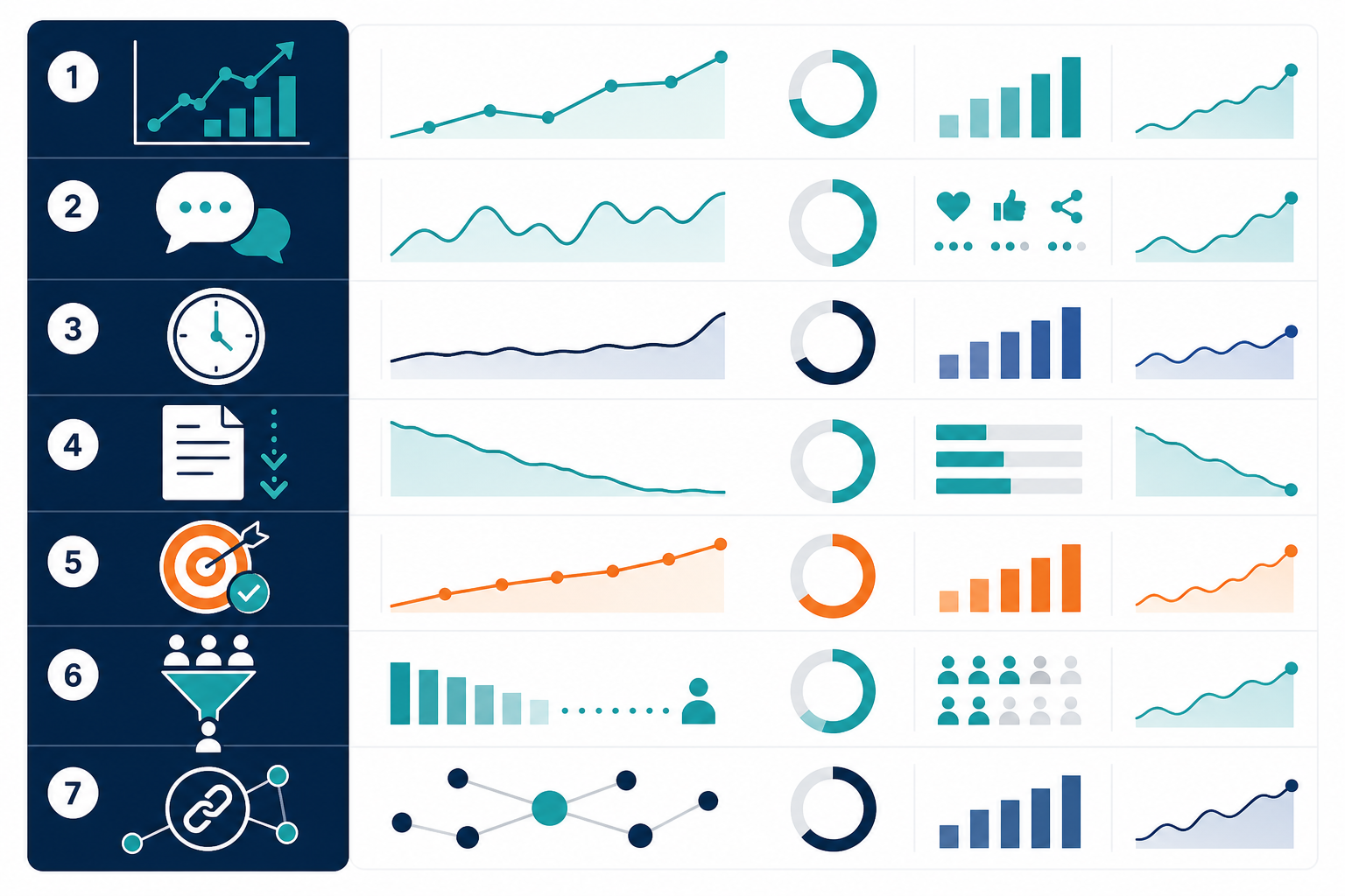
For cadence, I'd check discovery and engagement metrics monthly, review business outcomes against CRM data monthly or quarterly depending on sales cycle length, and run the quality diagnostic checklist at publication and again at every refresh. A word of caution on aggregation: assess these at the URL, topic-cluster, author, and account level, not just averaged across an entire client site. A handful of high-performing pages can mask a long tail of underperforming ones, and averages hide exactly the kind of decay you need to catch early.
If you're reporting to a UK client, benchmark against that client's own sector and market rather than importing global averages—a B2B services page in Manchester and a UK-wide e-commerce brand will have very different baseline engagement and conversion rates, even for genuinely excellent content.
How Does Content Quality Scoring Work?
Quality scores aren't magic, and it's worth being clear about what they are and aren't. Most platforms that offer them are internal diagnostics, not a Google ranking score—Google doesn't publish or expose anything comparable. What they're generally assessing is a fairly consistent set of things: SEO optimisation, including keyword relevance, structure, and internal linking; readability, including sentence complexity, formatting, and scannability; originality; and alignment with search intent.
A simple weighted model looks something like this:
| Criterion | What it checks | Typical weighting |
|---|---|---|
| Search intent match | Does the content answer the query type—informational, transactional, or navigational? | 25–30% |
| Structural quality | Heading hierarchy, scannability, and formatting | 15–20% |
| Readability | Sentence complexity, jargon, and paragraph length | 15% |
| Originality | Overlap with existing top-ranking content | 15–20% |
| E-E-A-T signals | Authorship, sourcing, and factual accuracy | 15–20% |
What separates a static checklist from something genuinely useful is whether the scoring system is checked against what actually happens after publication—not just at the point of creation. A score generated once and never revisited is a snapshot, not a quality measure.
This is where self-improving systems can, in principle, add value for agencies scaling content across multiple clients. The general idea is that an article's initial quality score gets compared against its actual post-publication performance—rankings, engagement, and organic traffic. Patterns that correlate with strong performance get reinforced in how future content is structured, while patterns that don't move the needle get phased out.
It's worth being honest about the limits of this, whatever platform is doing it. Correlation isn't causation—a page might perform well because of a strong backlink or a competitor dropping out, not because of its heading structure. Sample sizes at the level of a single client account are often small, which makes pattern detection noisy. And a system trained only on what's worked before can quietly reinforce yesterday's winning formula even as search demand and reader expectations shift.
As one example of this approach in practice, Scribe's platform builds a quality score at the point of generation and then compares it against how the published article actually performs, feeding that comparison back into future content generation for the same account. That's a vendor-reported mechanism, not an independently audited one, so I'd treat it as a genuinely useful input to a measurement plan rather than a replacement for the judgement calls above.
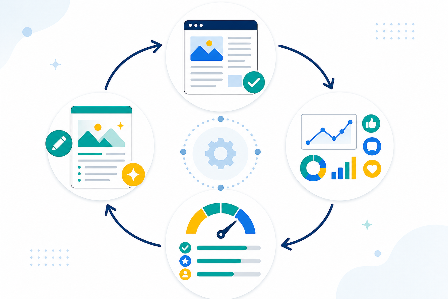
Think of the general pattern as a feedback loop rather than a one-time grade:
- An article publishes and starts generating performance data.
- That data—traffic, rankings, engagement, and conversions—is compared against the quality score assigned at creation.
- Patterns that correlate with strong performance get prioritised in future content.
- Patterns that don't move the needle get deprioritised or dropped.
This is different from a static content-scoring tool that checks a draft against competitor pages once and stops there. It's closer to how a good editor learns which formats their audience responds to over time—except, when the feedback loop is genuinely working, it's happening across every client account and every published piece, continuously, rather than relying on one person's memory.
How Should Agencies Report Content Quality Results to Clients?
Having the right metrics is only half the job. The other half is translating them into something a client without a marketing analytics background actually understands and values. Here's a process that works well for most agency-client relationships.
- Translate metrics into business language. Clients care about leads, revenue, and visibility, not raw session counts. Frame “engaged sessions increased 22%” as “more prospects are actively reading through to your calls to action.”
- Use a simple monthly scorecard rather than a dozen disconnected charts. A workable structure looks like this:
| Metric | Baseline | Current period | Change | Target | Source | Business implication |
|---|---|---|---|---|---|---|
| Organic sessions (topic cluster) | 1,200/mo | 1,540/mo | +28% | +25% QoQ | GA4 | More prospects entering the funnel |
| Average ranking position (priority keywords) | 14 | 8 | +6 positions | Top 10 | Search Console / rank tracker | Higher visibility for buying-intent queries |
| Engaged sessions | 41% | 52% | +11pts | 50%+ | GA4 | Content is holding attention, not just attracting clicks |
| Assisted conversions | 6/mo | 14/mo | +133% | 10+/mo | GA4 + CRM | Direct link to sales pipeline |
| Estimated lead value | £3,600 | £8,400 | +£4,800 | — | CRM | Retainer ROI in pounds, not just traffic |
- Show a worked example for refreshed content. Say you update an aging guide for a UK client. Before the refresh it ranked position 15 for its main term, drew around 300 organic visits a month, and converted at 1.2%. Three months after a rewrite that improved intent match and added original data, it ranks position 6, drives 950 visits a month, and converts at 2.1%. That's roughly 20 extra qualified leads a month from one page—a concrete, defensible story, and far more persuasive than a traffic chart on its own.
- Include context for dips or slow months. Algorithm updates, seasonal demand shifts, and industry-wide traffic softness happen. Explaining a dip builds more trust than pretending every month is a win.
- Use benchmarks with disclosed context, not headline percentages. If you cite a case study—your own or a vendor's—state the starting traffic, timeframe, and what changed. A figure like “a client saw a large increase in organic traffic over six months” is only useful to another agency if it comes with the baseline and the work behind it. Without that, treat it as a vendor-reported anecdote rather than a benchmark to promise clients.
If you're running heatmaps or session recordings through tools like Hotjar or Microsoft Clarity for a UK client, it's worth flagging UK GDPR consent requirements in your reporting. Cookie consent needs to cover behavioural tracking, and clients should know what's being recorded and why. It's a small addition to a report, but it signals that you're handling their site and their visitors' data properly.
This kind of reporting rhythm also protects you. When you've been showing context and honest trends all along, a slow month doesn't blindside anyone.
Tools for Measuring Content Performance
No single tool gives you the full picture, so most agencies end up running a small, deliberate stack. Here's how the major categories break down, along with a minimum viable version for agencies just building this out.

| Tool category | Best for | Limitation |
|---|---|---|
| Google Search Console + GA4 | Search visibility, clicks, impressions, CTR, engaged sessions, and conversions | Doesn't measure content quality directly; needs CRM data for true ROI |
| Ahrefs, Semrush, Sistrix | Rank tracking, backlink monitoring, and competitive gaps | Diagnostic only—a high score doesn't guarantee conversions |
| Hotjar, Microsoft Clarity | Heatmaps, scroll depth, rage clicks, and session recordings | Behavioural insight without search or revenue context; requires proper consent handling under UK GDPR |
| AI content platforms with built-in scoring, such as Scribe | Quality scoring at creation, performance-linked content refinement, and automated publishing | Vendor-reported scoring logic; best used alongside, not instead of, independent analytics |
If you're starting from nothing, the minimum viable stack is Search Console and GA4, connected to whatever CRM the client already uses, plus one rank tracker. That combination covers discovery, engagement, and business outcomes without much overhead. Add a heatmap tool once you have enough traffic on key pages to make session recordings worth reviewing, and add competitive rank tracking once you're managing enough keywords that manual checking becomes impractical.
The workflow that ties it together: pull discovery and engagement data from Search Console and GA4 first, reconcile conversions against the CRM so you're reporting real qualified leads rather than raw form fills, then layer in rank-tracker data to explain why visibility moved. Heatmap tools are best used selectively—on underperforming pages where you need to understand whether people are reading, skimming, or leaving in frustration—rather than as a blanket monthly report across every URL.
AI content platforms with quality scoring add speed and consistency to production, and platforms like Scribe generate SEO-optimised blog posts with supporting images in a matter of minutes, then publish directly to common CMS platforms. For an agency juggling multiple client calendars, that kind of automated production frees up time to actually analyse the numbers above, rather than spending it all on manual publishing and formatting. It doesn't replace the measurement stack—it just means less of your time goes into production and more into the analysis that actually earns renewals.
The agencies that stand out aren't the ones with the most tools. They're the ones who've built a measurement plan that connects each piece of content to an audience, an intent, a primary metric from each of the four layers, and a business outcome—then report on that consistently, month after month.
Frequently Asked Questions About Content Quality Metrics
What metrics measure content quality?
Strictly speaking, no analytics metric measures content quality on its own. Quality is best assessed through an editorial checklist covering intent match, accuracy, originality, and authorship. Analytics metrics show the downstream effects of quality: discovery metrics such as rankings and click-through rate, engagement proxies such as engaged sessions and scroll depth, and business outcomes such as assisted conversions. Track all four layers together, and be cautious about treating any single number as proof that the writing itself is good.
How do agencies report content success to clients?
Most agencies build a monthly or quarterly scorecard with a baseline, current figure, change, and target for each metric. They then translate that data into business language—leads generated, revenue influenced, and visibility gained—rather than presenting raw traffic numbers. The strongest reports also include a worked example, such as one refreshed page's before-and-after performance, plus honest context for dips caused by algorithm updates or seasonal demand.
What is a good quality score for a blog post?
There's no universal number, since scoring models vary by platform and none of them is Google's actual ranking algorithm. A strong internal score generally reflects solid intent match, clear structure, natural keyword usage, and genuine readability, weighted against originality and authorship signals. On platforms with performance feedback loops, a good score should also mean the content follows patterns that have measurably driven engagement and organic traffic for similar published pages. However, that link should be treated as a helpful signal, not a guarantee, given the small sample sizes involved at individual client level.
Related Articles

Content Quality Metrics That Actually Matter for Marketers
Discover the content quality metrics that predict long-term success, reveal true engagement and connect blog performance to meaningful ROI.
Content Quality Metrics That Drive Measurable Results for Multi-Client Marketing Agencies
Unlock content marketing ROI: Proven metrics that transform vanity stats into revenue-driving strategies for multi-client marketing agencies.

Create content like this automatically
Scribe uses AI to generate high-quality blog posts that engage your audience and drive traffic.